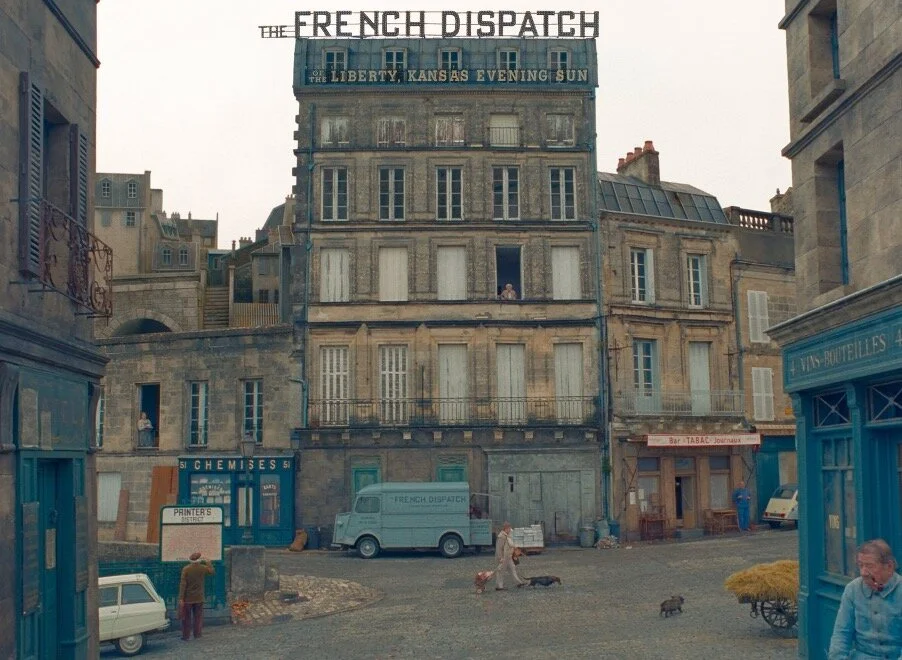
ERICA DORN’S GRAPHIC CREATIONS FOR WES ANDERSON’S “THE FRENCH DISPATCH”
Have you ever wondered who creates the graphics spotted in the detail of the films you see at the Movies? The hotly awaited The French Dispatch, is packed with signage, newspapers and historically accurate graphic matter.
DPS alumni Erica Dorn has worked with Wes Anderson on a number of films. Ishbel Amyatt-Leir joined Erica in France during her DPS year to work on graphic ephemera relevant to the historical period.
Created by illustrator Javi Aznarez, the poster, for instance, gives clues to the fictional magazine front covers he has made for the film, which is loosely inspired by The New Yorker.
The moment Wes Anderson fans have (not so) patiently been waiting for has arrived, and the film is available to see at the cinema. The entirely illustrated poster by Spanish creative Javi Aznarez not only portrays some of the film’s cast – including Timothée Chalamet in a bath with his hair wrapped in a towel, Benicio Del Toro painting and Owen Wilson sporting a beret – but also gives clues to the use of illustration in the film, which tells the story of a fictional magazine, apparently loosely based on The New Yorker. DPS alumni and Graphic designer for the film, Erica Dorn, tells us more.
“The French Dispatch is about a weekly magazine that started off as a series of columns in a Sunday supplement to an American newspaper, [called] the Liberty, Kansas Evening Sun.”
“The French Dispatch is about a weekly magazine that started off as a series of columns in a Sunday supplement to an American newspaper, [called] the Liberty, Kansas Evening Sun,” Dorn tells us, “and that has grown into a renowned publication, based in a fictional French city called Ennui-sur-Blasé. The stories in the film revolve around the editor-in-chief of the magazine and his beloved journalists.
“Javi Aznarez came on board to take on the role of creating the cover artwork for all of the issues of the magazine that are featured in the film (and as a hand double for the actor who plays the illustrator),” she continues, “and when Wes decided that the poster should also look like one of the covers, of course, it had to be Javi who did the illustrations.” On his Instagram, Aznarez revealed the poster, commenting it had been “an exhilarating year… topped with the final gift of drawing the poster,” and thanked Wes Anderson for “believing in [his] drawings”.
According to The New Yorker, Anderson has been a devotee of the magazine since he was a teenager, and has a vast collection of bound volumes dating back to the 1940s.
Serving a different purpose to the fictional magazine covers made for the film, the poster had to pack in far more detail. Though it does include the masthead details of the Liberty, Kansas Evening Sun – that it costs 200 Old Francs, for example – the film’s title is depicted in the style of the set’s signage, while the background illustration gives away snippets of the French scenery: people zipping on mopeds and sipping coffee outside cafes. It also reveals details of the film’s narratives, perhaps some of the dramatisations of the fictional magazine’s articles, with a man wielding a Tommy gun out the back of a car, chased by police, and a surreptitious man in black carrying a briefcase.
“The movie has a really rich cast of characters and is really dense in terms of storytelling, so the poster also has a lot going on to reflect that. It's packed with tons of little references to the people and places that are in the film,” Dorn explains. “The flashbulb lettering is based on the signage we designed for the outside of the French Dispatch bureaux.”
—
Full portfolio: Erica Dorn
Written by: Ishbel Amyatt-Leir
Featured in the WOW Newsletter | Designing For The Future
Photography courtesy of Searchlight Pictures


